Category: My Art & Illustration

How To Make A Quick & Easy Art Calendar Layout

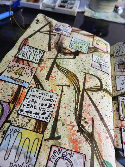
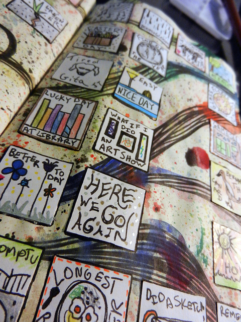
I have been a very active participant in Kate Crane’s 365 Days Art Calendar Challenge for all of 2012 and now 2013! During 2012, I didn’t make much time for art, so usually my monthly art calendar would be my only project going. Because of that, I would pour my heart and soul into it, and create time consuming multi-step layouts with illustrations. This year, however, I am making a lot more time for art. I usually have many projects going at one time, and I am finding myself at the start of a new month with no calendar layout even started! I’m sure many of you find yourselves in this same boat. The good news is that it doesn’t take very long to create a new calendar layout that will be fun to journal on throughout the month.

Below, I will show you how to create a quick and easy art calendar layout that you can finish, last-minute, in a couple of hours or less. I have used this process to create my February and March pages, and the steps below show my May page coming together this same way.

You will need:

  • Your art journal, or whatever surface you are using to keep your art calendar
  • Paint – I used watercolor, but you can use whatever you like best
  • Glue – glue stick, Mod Podge, whatever you like. I used both a glue stick and Mod Podge
  • Colorful paper scraps & embellishments – I am assuming most people that journal or scrapbook have a paper stash. If not, go through a magazine and rip or cut out whatever is interesting to you
  • Pens or markers – whatever fun pens you like using.
  • Card stock or sturdy paper – paper you will use to create your calendar squares
  • Scissors or cutting knife w/cutting mat
  • ruler

Step 1 – Open your journal to a blank page and arrange your supplies around you.

Art Cal How To 1

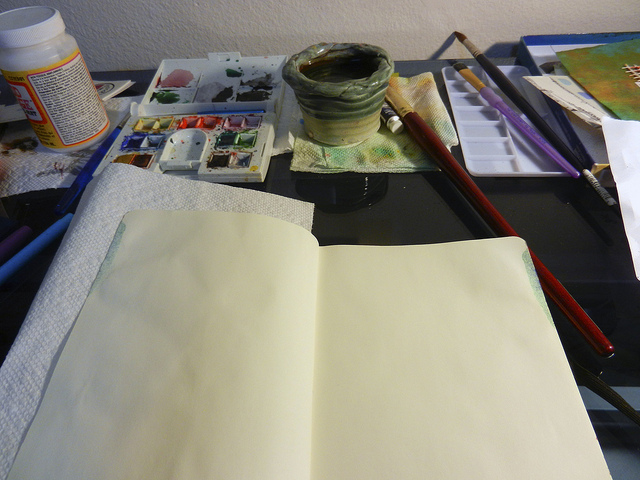
Ah! The possibilities of a blank, new page! I like to open my journal to a new page, and put a piece of paper towel underneath the left page, so the water from my watercolor paint doesn’t get on the finished pages underneath. Then, I set up my paints, brushes, glue, and whatever else I think I will need in front of the journal.

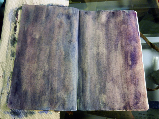
Step 2 – Paint your background.

Art Cal How To 2

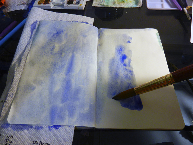
We’re going to get our art calendar off to a fast start by filling in the two pages with a painted background. I know I want a purpley-blue background, so I added a blue watercolor wash first. Continue to add more colors, mix them together on the page, or add more layers of color until you get the color you want. Do not try to make this look nice or perfect or even. This should be a very quick step. We are not going to see much of the background at the end, and I actually think pages look better if the background is a bit messy looking.

I added several more layers of color until I got the purple/blue I was looking for. Sometimes it helps to dry your pages before adding more paint, and you can use a hair dryer to speed up this process. I used a hair dryer to dry my pages at the end, so I could quickly move onto the next step. Here’s my finished background:

Art Cal How To 3

Step 3 – Choose paper scraps you will use to cover up your background.

Go through your paper stash and pick out some scraps you would like to use to make a collage all over your pages. When I am in a hurry, I use the following two rules for quickly going through my stash and picking out papers:

  • Choose papers in a color that closely matches the background.
  • Choose papers in a contrasting color to the background. To make it really easy, you can make your contrasting color a complimentary color to your background.

I’ve found that choosing papers and items according to those rules will pretty much guarantee that my layout will come out looking pretty good and interesting. But, of course, take your own artistic liberties!

Place all your papers in a pile or in a container to keep them from going all over the place. Here’s what I chose for this layout. I am using an upside-down box lid to hold them in a pile on my desk.

Art Cal How To 4

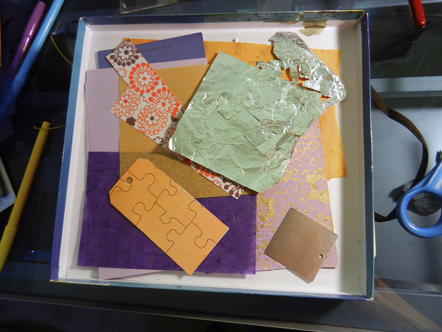
You can see I choose some purple papers, which go with my painted background. I also choose some contrasting papers in an orangey-yellow color. Violet and yellow are color compliments, and so are blue and orange, so I thought this light orange assortment of contrasting papers would look good. I also choose some silver foil, and a paper printed with a gold metallic ink to add some shiny (I love my shiny!)

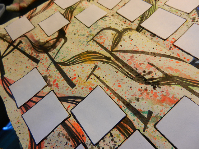
Step 4 – Get your collage on.

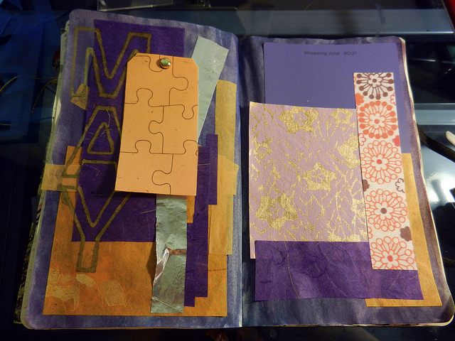
This is probably my favorite part of the whole process. Take your papers that you picked out from your pile and just start gluing them on to your pages to create a collage across both pages. You can cut them up, punch shapes in them, rip them up before gluing, whatever you want! Just don’t think about it too much. Layer up those papers and stick ’em on. I just used a kid’s glue stick for this part. It will come out great. Here’s how mine turned out:

Art Cal How To 5

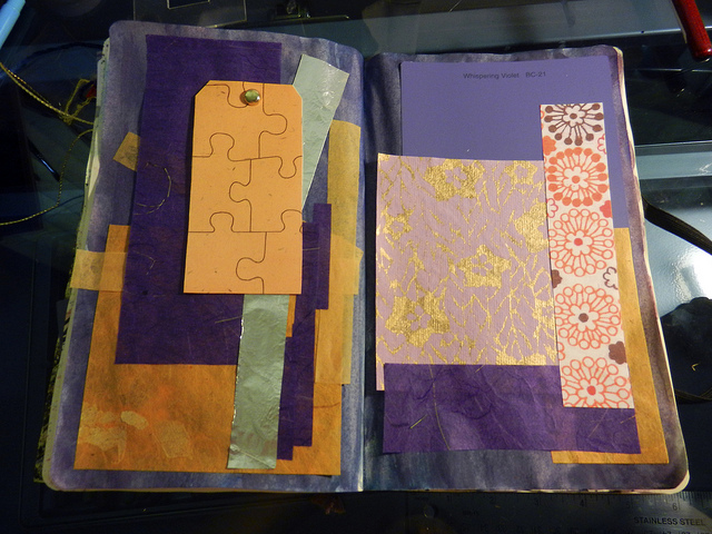
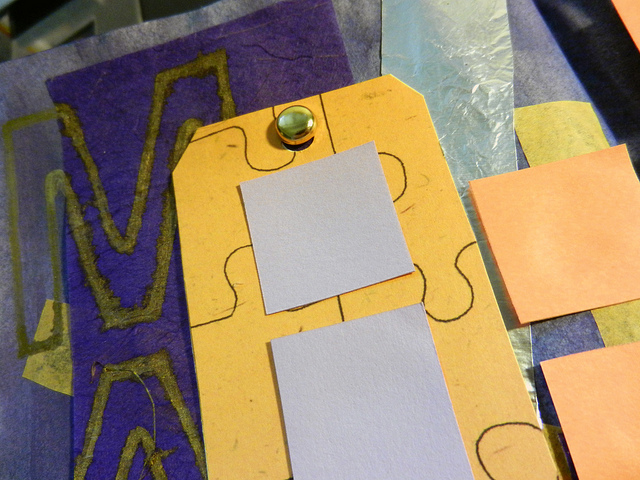
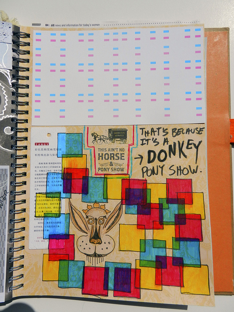
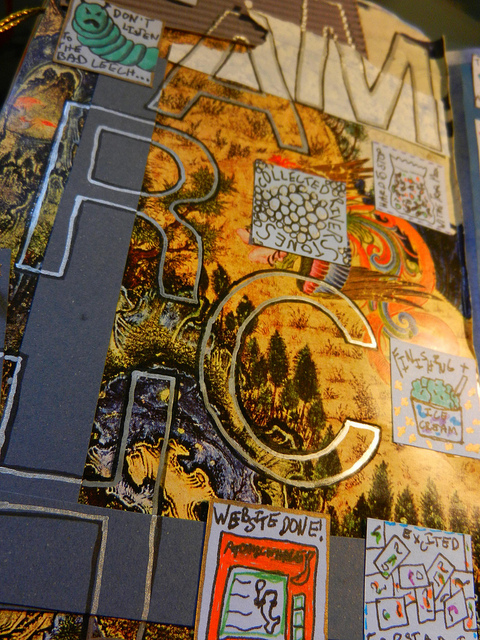
You can see here I didn’t cut up my papers too much. For this process, I like using simple square or rectangle shapes. You can see how the contrast between the blue/purple papers and the contrasting yellow papers adds a lot of interest without much effort. I used a few patterned papers on the right side page just to take it a bit further. I added the yellow tag on the right with a gold-colored paper fastener thing. This element will give the page a little depth, and you’ll see that more once we get to the lettering in the next step.

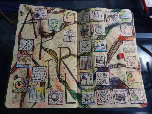
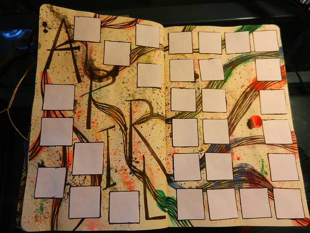
Step 5 – Add your letting for the current month.

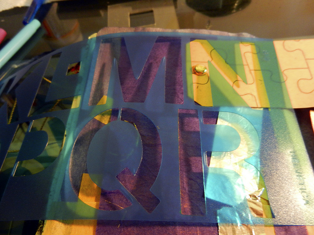
Once you have your collage all set the way you want, it’s time to add the lettering for the current month. The calendar I’m making is for May, so I need to add “MAY” somewhere in this layout. You can do this lettering anyway you want. You can doodle it, stamp it, make paper cutouts for the lettersĀ  – again, whatever you want! When I am in a hurry, I like to add my lettering using stencils and cool pens. A few months ago, I bought several sets of C-Thru Helvetica stencils in a few sizes, and I have used them SO MANY TIMES. I love them. I got them for a few dollars per set at my local art store.

So, here, I am using my stencils to create the word “MAY” vertically along the left side page. Luckily, May is only three letters long, so this is a very quick process!

Art Cal How To 6

I used my gold metallic pen to stencil in the letters. After I got the initial outline down, I went over it with the pen again to make it a bit thicker on the page. I also turned that yellow tag to the side while I did the letters, because I thought it would look cool to have the letters peek out beneath the tag – also adds more depth. Here’s how it looks all done:

Art Cal How To 7

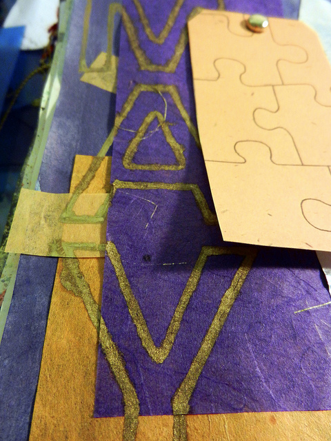
You can see the gold ink bled a little into some of the papers. I love this! Embrace your happy accidents.

Alright, so now we have our whole background with collage layers, and our lettering all done!

Art Cal How To 8

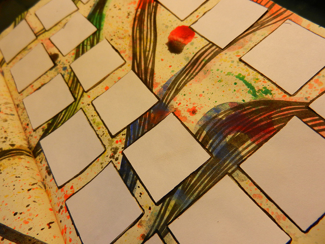
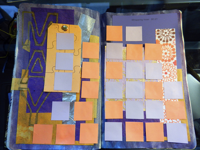
Step 6 – Add your calendar squares.

This is the last step! We’re almost done! Now that we have our background, collage/interest elements, and lettering done, all we have to do now is add the blank squares we are going to journal on throughout the month. For me, this is not that much of a creative step, but sort of a tedious one that just needs to get done. So put on some tunes, and let’s get it done.

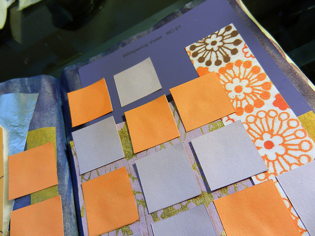
Pick out some card stock or heavy paper to use for your squares. Just make sure it’s a light-ish color, so you can see your journaling easily over the color. For my layout, I am going to choose a light purple and also a light orange paper.

Take your paper and cut it into one inch by one inch squares. I use an exacto knife, cutting mat, and metal ruler for this. It really helps if your cutting mat has a grid on it, so you can just line up the paper. You can also just draw a grid on the paper and cut it with scissors. This doesn’t have to be precise or perfect. I’ve also seen others use a circle punch or other non-square shapes and sizes of paper to make the calendar days. By this point, I hope your inspiration is flowing, so you can make the “squares” whatever way would look best on your page!

Art Cal How To 9

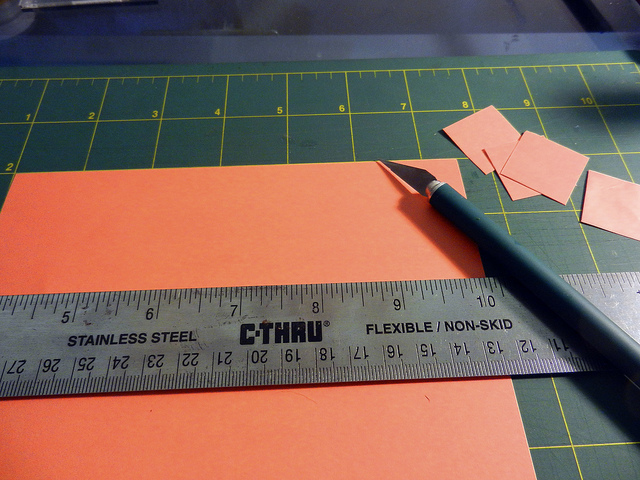
I cut out about an equal number of orange and purple squares. Just make sure you have enough for all of the days in the month!

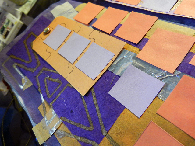
Now, you can just start gluing the squares right onto your page or you can lay them out on the page in the orientation you want to see how they look best before gluing. I like laying them out first:

Art Cal How To 10

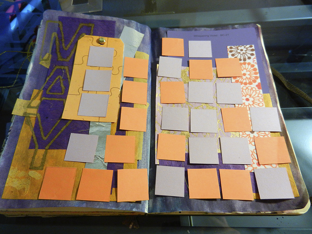
I settled on this layout for my squares. I mixed together the orange and purple squares willy nilly. I also placed a few on the orange tag. I encourage you to abandon the idea that the squares need to be laid out in a perfect grid just like you would see on a real May calendar. They can be however you want.

Once you are happy with the placement of your squares, glue them on! I use Mod Podge for this process, because I think it works better with card stock than a regular glue stick.

You’re done!

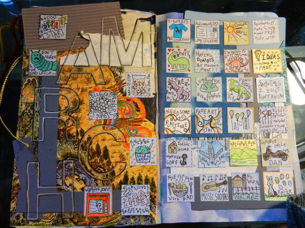
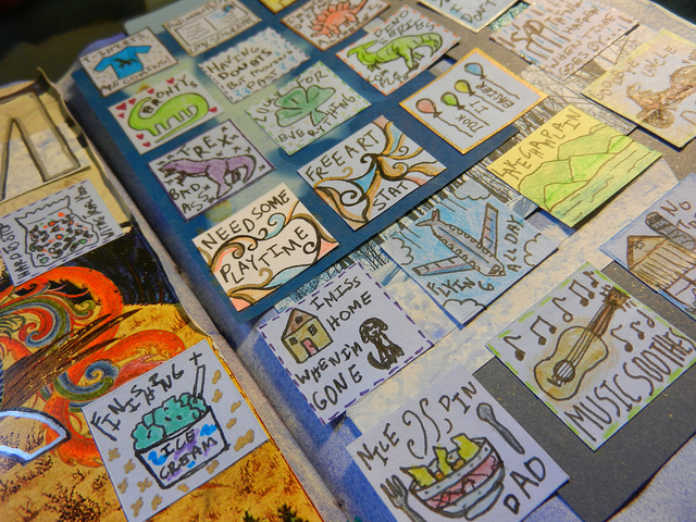
Bam! Now you have your art calendar all ready to go for daily journaling for the whole month. Take a few moments to bask in its glory.

May Art Cal Filled In


Remember that it doesn’t take long to create a pretty calendar that reflects who you are. In a couple hours (or less!) we completed this project start to finish!

Take a few pictures of it, share it, admire it, and enjoy it for the whole month ahead!

May Art Cal Filled Close Up 1

May Art Cal Filled In Close Up 2

May Art Cal Filled In Close Up 3

April Art Calendar Filled In

Whoosh! Another month gone forever! All that’s left is this filled in art calendar.

April Art Cal Filled In

My squares this month are pretty colorful, and go with the busy colorful background I made. Having all white squares was pretty interesting. They really made the colors from the colored pencils and pens I use pop out. I even had a guest artist fill in one of the squares for me. I’ll let you figure out which one it is!

Here are a few close up pictures:

April Art Cal Filled In Close Up 1

April Art Cal Filled In Close Up 2

I am on time for my May calendar this month! Yay! I will have that posted tomorrow along with a tutorial on how to do a quick and dirty art calender page layout.

Journaling From Prompts: Green

Here is another Smash journal page I created using one of Daisy Yellow’s No Frills Creative Prompts. This prompt is “GREEN”. I couldn’t really think of a clever take on the word ‘green’, so I just created a green collage:

Smash Journal - Green

I used drawing ink, paper, markers, and a metallic gold pen. Looking at it now, I wish maybe I didn’t put the green dots as the background, but that’s ok. I really like how the letters and the shapes with the gold pen turned out.

New Portland, Oregon Design – Available as Print or Card!

I sort of got invited to a friend’s birthday party in Portland this weekend. I still don’t know if I will be going up there or not, but I wanted to have something for the birthday boy just in case. The birthday boy recently moved to Portland within the past year or two, so I came up with this drawing to celebrate that.

PDXHomeMain

I’m thinking about expanding on this drawing and doing a series for different cities and states. I have this design available in my Etsy store as a print or a card.

PDXHomePrint

PDXHomeCard

Journaling from Prompts: Perspective

There are times when all I want to do is sit down and doodle, or glue things, or make something, but I am at a loss for a clear idea or vision. At these times, it definitely helps to have some kind of restriction or problem to solve to get your creativity going. Recently, I found this great list of simple prompts at Daisy Yellow, and I’ve started making little collages in my Smash journal based on each one.

The first prompt is Perspective. In the prompt, she offers a photo of a fence for inspiration. I used the imagery of the fence and some of the colors in the picture to make my own interpretation:

Smash Journal - Perspective

I don’t put dates on many things in this journal, but here I noticed I dated this one last September! I can’t believe it’s been that long!

Smash Journal Play Time

Smash Journal - Outside

During the last few days I have been working in my Smash journal. The idea behind Smash is that it gives you a place to put anything you want into a book. It doesn’t have to be arty or pretty, or have any kind of theme or structure. You can do this with any type of journal or book that you would like. I bought my official Smash branded journal last year as a treat for myself, and because they were on sale at my local craft store. I love working in this thing. The quality of the book is great – the pages are made out of sturdy cardstock and spiral bound. You can see I’ve crammed a crapload of stuff into my pages, and the book is not falling apart at all. Each page also has a different background, which can help get you started, since sometimes it’s intimidating when you are starting with a glaring, plain white page.

I have been using my Smash book mostly to collect bits and things that I find. Here are a few of my favorite random collage pages using a mix of different things:

Smash Journal - Collage 1

Smash Journal - Collage 2

Smash Journal - Collage 3

Smash Journal - Collage 4

Sometimes, when I go to an event, or on a trip for several days, I will make a point to collect things along the way, and then make a two-page spread with my findings. Here are a couple of those:

Smash Journal - Collage 5

Smash Journal - Collage 6

I have also been using the book to save little art experiments and drawings I have done on loose paper. Here’s a couple pages with some drawings from a contour exercise I did. I just love those giraffes with the orange and yellow!

Smash Journal - Contour Giraffes

During the past week or so, I have been using the Smash book more as an art journal. I feel more free working in this book. Maybe it’s because I have already created so many pages on the fly that ended up looking great, so I’m less scared to make unplanned art journal pages in here. I usually do art journal pages in a Moleskine, but sometimes I get intimidated by having to have a clear vision for each journal page, and execute that vision perfectly. I’m not sure if it’s because the Moleskine is expensive and a little pretentious or what, but I have a hang up about it for some reason!

Here are the art journal pages I worked on this weekend in my Smash book. These pages were very much unplanned. I really love the first two below. I don’t like the lion illustration very much, but that’s ok.

Smash Journal - This Weekend 1

Smash Journal - This Weekend 2

Smash Journal - This Weekend 3

Working all spontaneous in my Smash book has been so therapeutic. Sometimes I wish I could just crawl right into this book!

Matchbox Mixed Media Sculpture Featuring a Sweet Viking Ship and Champy

Recently I was asked by my friend, Emily (via Robert!), to create a small artwork out of a matchbox to be auctioned off at a Matchbox Gala, benefiting Naropa Community Art Studio – International. NCAS-I is an organization created to provide art therapy to those in need, around the world. They are currently getting ready to travel to Cambodia to help survivors of sex-trafficking. This project sounded right up my alley, so I gladly agreed!

Here is my finished matchbox creation:

Matchbox Art - Finished Whole 1

Oh…holy cow! I mean, it’s pretty great. It’s got a viking ship AND a Champy. I mean, come on, isn’t it the bomb?! I am very happy with the way it turned out! I am also a little frightened to mail it off to Boulder for the gala! You can find out all the steps I took to make this by reading below, complete with pictures!

I was provided a matchbox to use. It came in the mail in a cute little bag with a stamped card:

Matchbox - Just Arrived

I immediately had an awesome idea! I knew right away that I wanted to make the matchbox into a viking ship, using the matches as the oars that stick out from the ship’s body through holes in its side. After a little bit of careful deconstruction, cutting, and reconstruction, I had my ship’s body and oars:

Matchbox Art - Ship Construction

The next step was painting the ship and making the sail. But, I had to wait for the glue to dry first. The hardest part of this whole operation, was waiting for the glue to dry. I just wanted to keep going! I used my hair dryer to speed up the drying process, but it still took quite a bit of time. I painted the ship’s body dark brown, and them mixed a lighter yellow/green/brown for the oars.

Matchbox Art - Ship Front Close

You can see a sneak peek of the sail above. The sail was a fun little project. I looked through my paper stash and found a light brown, thin paper, similar to the brown paper towels you find in public bathrooms. I cut out the shape of the sail, and used a bit of watercolor to add some darker tones around the edge of the sail. Then, I covered it all in Mod Podge to make it sturdier and give it an aged finish. The sail looked good, but it looked a bit plain to me. I figured it needed a sigil (don’t we all?). I know fewer magical creatures more badass than a unicorn, so unicorn it was! I also knew I had a previous drawing of a unicorn from one of my art calendars I could use. I used Photoshop to grab the outline of the unicorn, printed it out, painted it, and used Mod Podge to add it to the sail. I am very happy with the way the sail came out:

Matchbox Art - Sail Front Close

You can see I used a few metal brads in the sail’s corners to make nice holes I could use to tie the sail onto the mast. I used some twine to tie the sail onto the mast and then reinforced it with Mod Podge. I also added some more twine to the mast joins for decoration:

Matchbox Art - Ship Back Close

The mast was made out of a kebab skewer that I found in one of our kitchen drawers. (Isn’t it the most beautiful ship you have ever seen with a kebab?)

I feel like the ship would have been a great finished project on its own, but I couldn’t stop there. Why? Because, another thing I was DEAD SET on from the beginning, is including a Champy! (If you are not familiar with Champy, please read about him here. I grew up in Champy’s hood.) In order to have a Champy in the piece, there has to be a body of water. I cut out the shape for the sea from a piece of blue vellum, and also a blue paper printed with a photographic cloud scape. I laminated it using a sheet of self-seal laminating plastic from the office store, and BAM! instant sea! You can see it nicely in the photo above.

To create Champy, I printed out two small images of my swirly drawing of Champy on art paper. The two images mirrored each other. Then, I cut both Champys out, and glued them together, so his image would be on both sides. Now it was time to put it all together:

Matchbox Art - Champy Finished Ship and Sea

I wanted Champy to look like he was swimming in the water. So, I used my knife and cut a slot in the sea that he could fit through. You can barely see the slit I cut in the above picture. It is in the sea right above Champy and to the left of the ship. This was a bit nerve-wracking, because it had to be kind of precise. After I cut out the slot, I pushed Champy through and glued him there. I like how his legs and tail dangle beneath the surface:

Matchbox Art - Champy Bottom Close

In order for Champy to dangle like that, I needed to have a base to hold this whole thing up. I didn’t know how I was going to do that, but I knew I would figure it out, so I didn’t worry about it. I wasn’t really thinking about the base when I found a jewelry box underneath my drawing desk. It must have fallen and gotten kicked down there a while ago. I picked up the box, opened it up, turned its lid upside down, turned it’s bottom upside down, put the bottom on top of the lid and I had the perfect base for my project. Totally serendipitous. I glued the base together and painted it dark blue to match the sea. I waited until the very end to glue the sea onto the base.

By now, I was kind of ready to be done with this freaking thing, but there was more I wanted to add, so I had to power on! I had a specific message in mind for this piece, so I wanted to add some words to it, so people would easily understand what I was going for. The theme of the Matchbox Gala is Small Resources = Big Possibilities, and my piece is about possibilities. I am all about wanting everyone to be open to unlimited possibilities in their lives. Anything is possible – you can do anything! The problem is that a lot of people don’t believe it. They don’t believe anything else is possible, other than their shitty situation. Well, I believe something else is possible. So, I decided to add those words to the piece:

Matchbox Art - Adding Lettering

I found a couple sheets of textured paper in my stash that matched the color theme of the ship and the sea. I added the words to the orange paper using some rub-on letters. I didn’t have all of the letters I needed of the same font, so I just mixed it up. I think it looks cool! I used some dark blue textured paper to place beneath the orange paper with the words to give it depth. Then I glued the whole thing to the sea using Mod Podge:

Matchbox Art - Lettering Close

The Mod Podge made the orange paper a little transparent in some areas, but I think it looks good.

At this point, I really seriously wanted to be done, like really bad, but I put it all together and I just thought it didn’t look quite done yet. The sea looked too flat. So, I added a few waves to the sea using some colored vellum paper. I cut the shapes out for the waves, then carefully cut slots for them in the sea so they stuck out perpendicular like Champy.

Matchbox Art - Champy Top Close

That was it! I was done! I glued the sea to the base, and then sat back and basked in it’s glory. My three day adventure (the glue and the waiting!) constructing this piece had come to an end!

Matchbox Art - Finished Whole 2

This piece will be auctioned off with about 200 other matchbox masterpieces this Friday at the 2013 Matchbox Gala in Boulder, CO. I hope it gets some bids!

Matchbox Art - Finished Whole 3

Now to carefully pack it up and get it to Boulder by Friday. Yikes!

April Art Calendar Set Up

The beginning of April happened during my unanticipated trip home to upstate NY. I did this April art calendar quickly and with limited supplies:

April Art Calendar Set Up

You’ll see I just drew the lettering with some swirling ribbons coming out of the them. Then, I just watercolored in a rainbow in the swirly ribbons. After that I had a little fun and added some rainbow splatters to the page. After that dried, I just added some white squares with glue, and outlined in black around them. I have never pre-outlined my squares like this before. I like the way it looks now, but I’m wondering if I will like it as I am journaling in the squares. We’ll see!

I am definitely taking a more “free” approach to my calendar layouts this year. Since I have so much more time to focus on other art projects now, my calendars are more of an afterthought. I think of the layouts more as experimental playtime. They are more spontaneous and quick rather than planned out and executed with perfection in mind.

Here are a couple of close-up pictures:

April Art Calendar Set Up Close Up 1

April Art Calendar Set Up Close Up 2

March Art Calendar Filled In

This year, I feel like March came in like a lamb and out like a lion. This month was seriously, bananas. Here’s my art calendar all completed:

March Art Calendar Filled In

I managed to use a lot of bright colors in my squares this month, which always makes me happy when looking at them as a set. The latter half of this month was interrupted by an unanticipated trip I made back to my hometown of Plattsburgh, NY. It was for a sad reason, but I am very happy that I got to spend that time with my family. I look at the squares before that trip happened, and I see I also made a lot of progress on some of my goals, so that makes me happy too.

Here are some close ups of the squares:

March Art Calendar Filled In Close Up 1

March Art Calendar Filled In Close Up 2